A modular design system created for an i-Gaming platform supporting sports betting, casino games, and real-time interactions across web and mobile.
The goal was to design a system that performs under high-frequency usage, scales across multiple brands, and stays compliant with responsible gaming and accessibility standards—without sacrificing clarity or speed.
Role & Device Platform
Product Designer / Web, Tablet & Mobile
Domain & Tools
i-Gaming / Figma
Problem Scoping
The Challenge
i-Gaming products operate at the intersection of speed, data, and risk. Users make rapid, high-stakes decisions while interacting with dense, real-time information. At the same time, platforms must meet strict regulatory and ethical standards.
Key Problem
1. Fragmented Ul patterns across games and betting flows 2. Limited scalability for new bet types and features 3. Heavy design-development rework 4. Accessibility and compliance gaps 5. Slower feature and campaign launches.
Design Goals
A design System was introduced to act as a single source of truth.
System Need
Consistent Ul across products and platforms
Faster feature rollout with reusable components
Built-in accessibility and compliance
Flexible theming for multi-brand deployment
Reduced design and engineering overhead
UX Realities
Visual hierarchy directly impacts user decisions
Latency and feedback influence trust
Ambiguity can lead to financial and legal risk
Responsible gaming must be embedded, not optional
Target Outcome
Consistent Ul across products and platforms
Faster feature rollout with reusable components
Built-in accessibility and compliance
Flexible theming for multi-brand deployment
Reduced design and engineering overhead
Core User Group
Casual bettors
High-frequency bettors
VIP users
Admin and risk teams
Foundations
System Architecture
The design system is structured to scale from
tokens to full product experiences.
Layers
Foundations
Components
Interaction Patterns
Templates
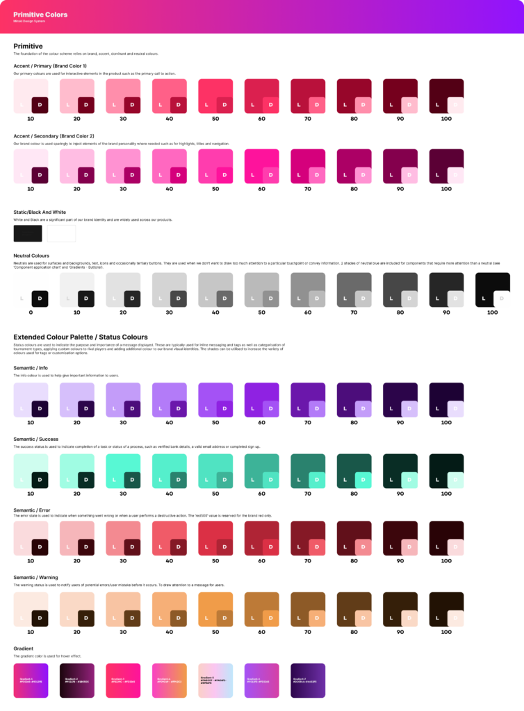
Colors
A semantic color system designed for clarity, trust, and accessibility.
WCAG AA contrast compliance
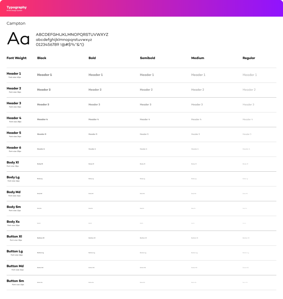
Typography
Clear hierarchy for dense layouts
Highly legible numerals for odds and balances
Monospaced numbers for financial accuracy
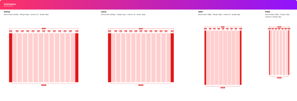
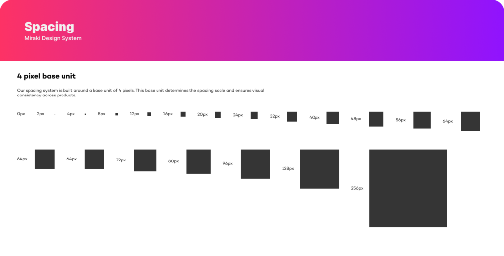
Grid & Spacing
Layouts are built on an 8-point grid to support consistency and density.
Touch-friendly targets on mobile
Scannable data layouts
Predictable spacing across components
Core Components
Reusable component library designed for speed,
flexibility, and reliability.
Key Components
Button
Input Fields
Tables
Headers
Alerts
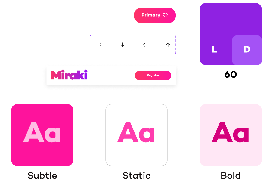
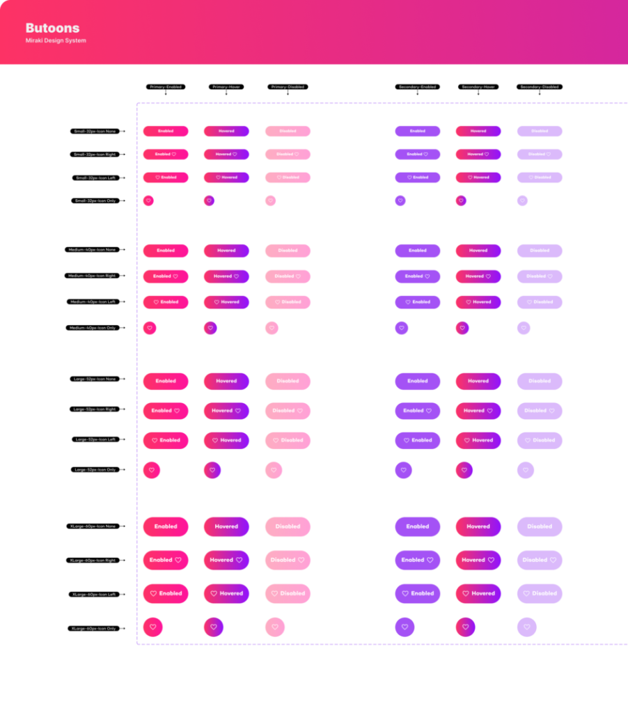
Buttons
Buttons allow users to trigger actions such as submitting forms, saving data, or navigating to another step. They provide clear visual feedback through different styles, sizes, and interaction states to communicate availability and priority of actions.
Button Types
Primary – Main action button used for the most important task.
Secondary – Used for alternative or supporting actions.
Tertiary – Minimal style for low-priority actions.
Outlined – Transparent button with border emphasis.
Text – Button without background or border for subtle actions.
Warning – Used for destructive or critical actions.
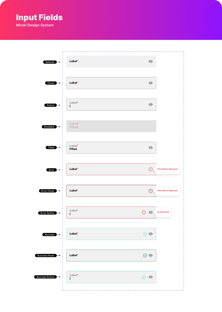
Input Fields
Input fields allow users to enter and edit information in forms. Each field includes a label, input area, and optional icons(like visibility or validation). Different states help guide users and provide feedback during interaction.
Default – Initial state before interaction
Hover – Appears when the cursor is over the field
Active (Focus) – When the user clicks or types in the field
Disabled – Field is inactive and cannot be edited
Filled – Field contains user input
Error – Invalid input with error message
Error Hover – Hover state when error exists
Error Active – Focus state while fixing error
Success – Valid input confirmed
Success Hover – Hover state with valid input
Success Active – Focus state with valid input
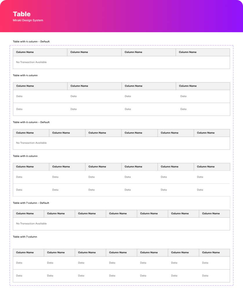
Table
Tables organize and display structured data in rows and columns, allowing users to quickly scan, compare, and analyze information. They are commonly used for lists, transactions, reports, and data management interfaces.
Table Variations
4 Column Table – Used for simple data structures
6 Column Table – Suitable for moderate data complexity
7 Column Table – Used for detailed datasets with more attributes
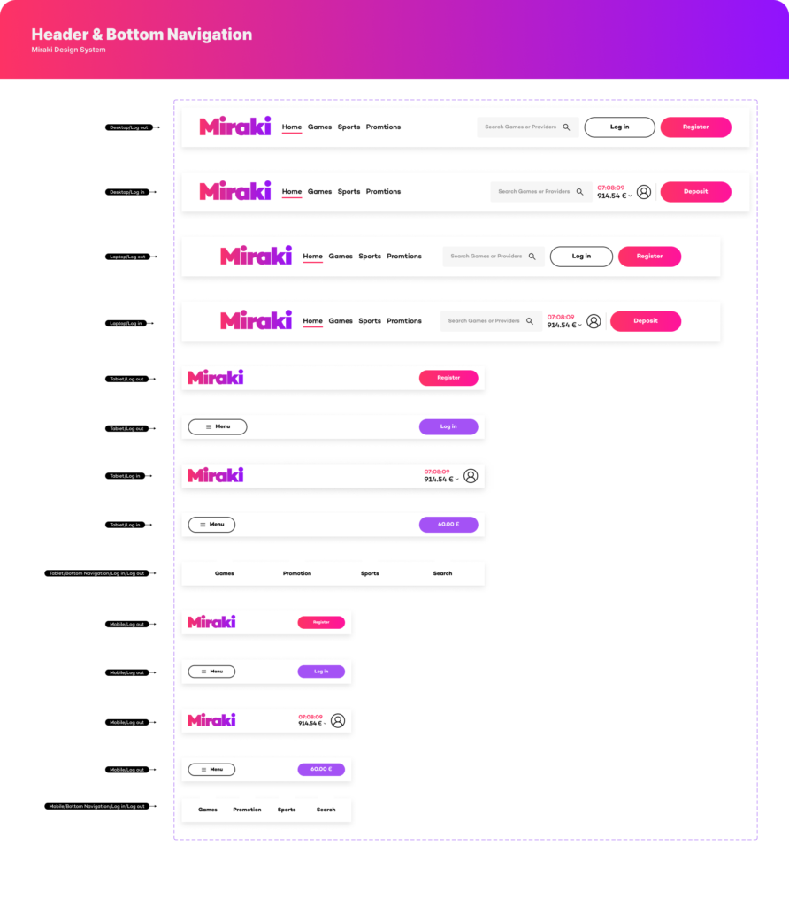
Header & Bottom Navigation
Headers and bottom navigation components help users navigate the platform, access primary features, and perform key actions. They adapt across different devices to maintain usability and accessibility.
Header Elements
Logo – Represents the brand or platform identity.
Navigation Links – Main sections such as Home, Games, Sports, and Promotions.
Search – Allows users to quickly find content or providers.
User Actions – Login, Register, Deposit, or account access.
Responsive Variations
Desktop Header – Full navigation with search and account actions.
Laptop Header – Similar structure optimized for slightly smaller screens.
Tablet Header – Simplified layout with menu and key actions.
Mobile Header – Compact header with menu and primary action buttons.
Bottom Navigation
Primary Navigation Tabs – Quick access to core sections such as Games, Promotions, Sports, and Search.
Mobile Optimized – Positioned at the bottom for easy thumb interaction.
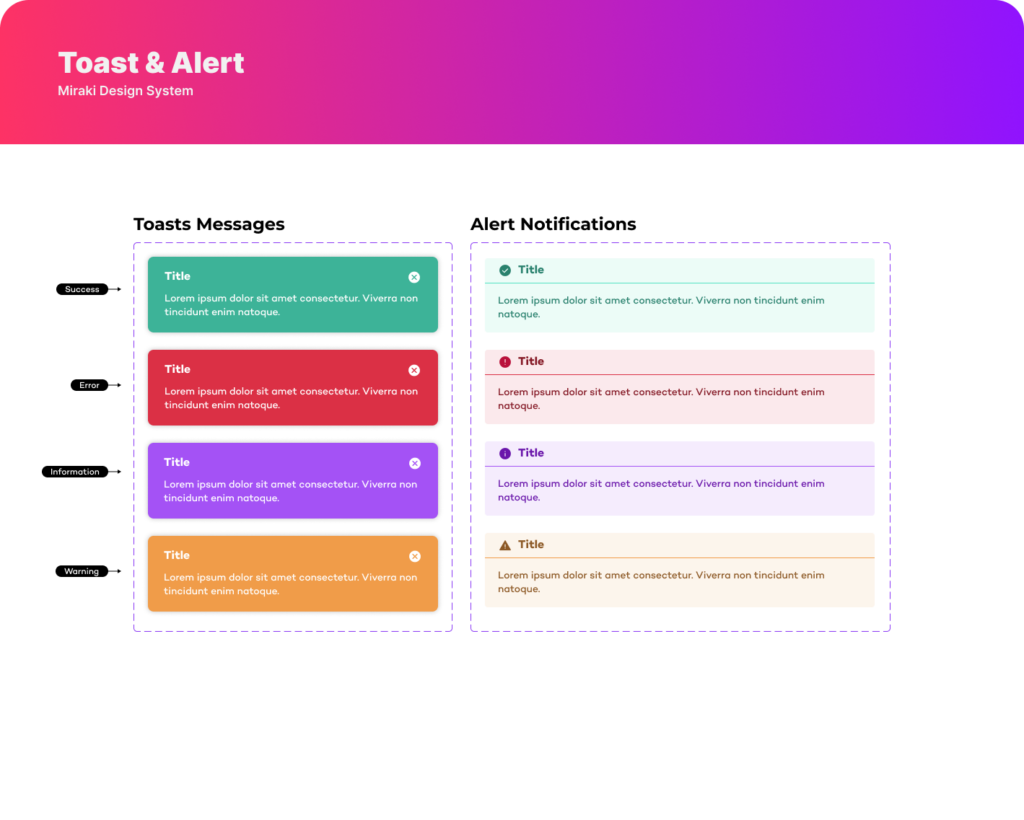
Toast & Alerts
Toast and alert components provide feedback and notify users about system actions, updates, or errors. They help communicate important information clearly without interrupting the user’s workflow.
Alert Types
Success – Confirms that an action was completed successfully.
Error – Indicates that something went wrong and requires attention.
Information – Provides helpful updates or general information.
Warning – Alerts users about potential risks or important actions.